



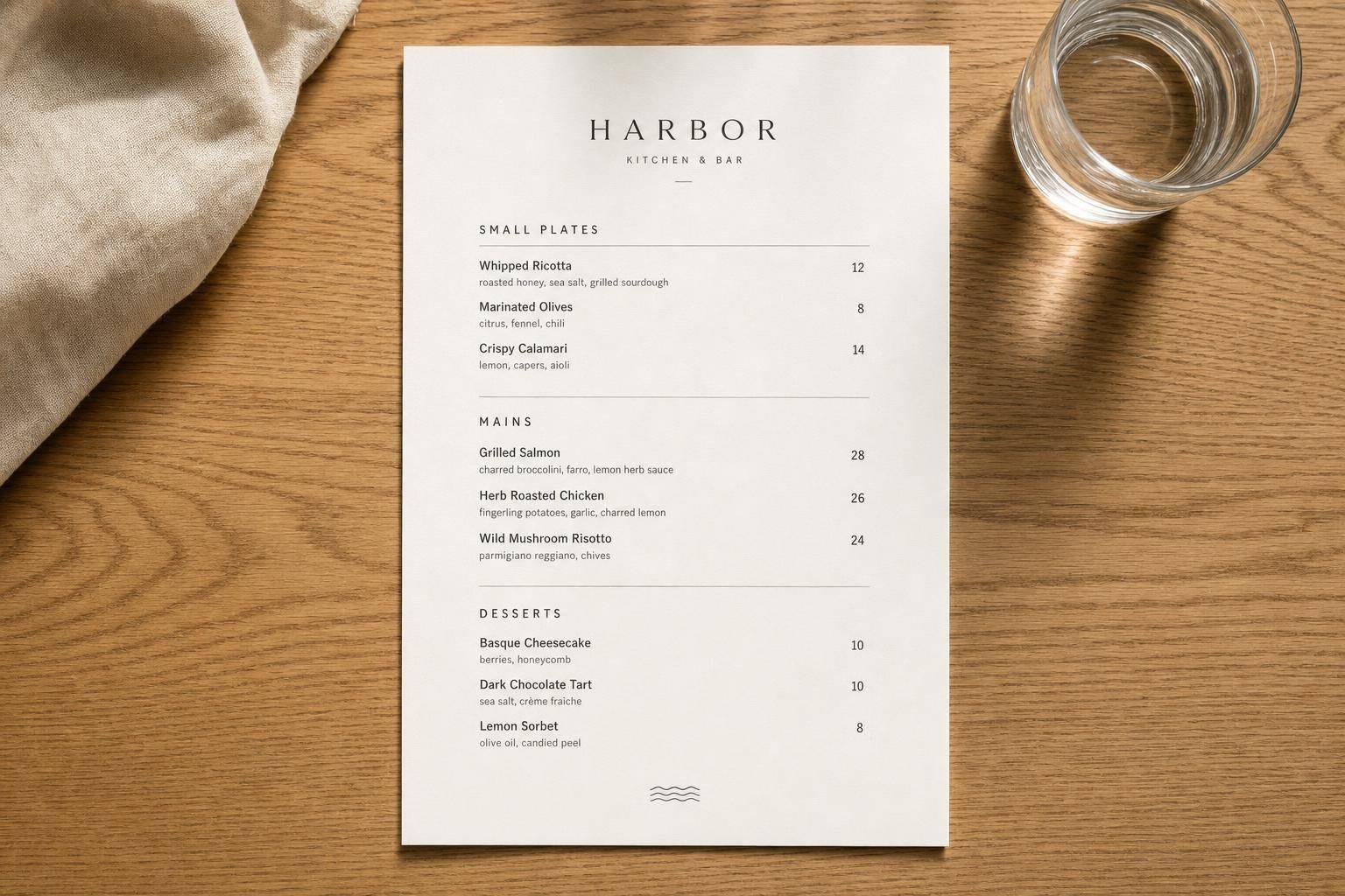
A menu is easier to use when the layout gives each item enough room. I’d focus on 7 rules: set page margins, use clear line spacing, group each item into a small block, leave white space between blocks, add clear section breaks, place prices cleanly, and keep text short.
Here’s the short version: spacing matters more than decoration when guests need to read in a dim, busy room. The article points to a few strong numbers, including 71% of restaurants in one study not following menu design rules, and a pricing test where guests spent $5.55 more on average when menus used numerals without dollar signs.
If I wanted the fastest takeaway, it would be this:
- Margins: use about 0.5 to 1 inch
- Line spacing: about 120% to 150% of font size
- Grouping: keep item name, short description, and price close together
- White space: separate items so the page does not feel packed
- Sections: use clear headings like Appetizers and Desserts
- Prices: avoid dotted leader lines; keep format consistent
- Text density: cut extra words so guests can scan with less effort
Quick Comparison
| Rule | What I’d do | Main effect |
|---|---|---|
| Margins | Leave 0.5–1 inch around the page | Makes the page feel less cramped |
| Line spacing | Use 120%–150% leading | Helps guests keep their place |
| Grouping | Keep each dish in one tight block | Makes each item easier to scan |
| White space | Add space between items and sections | Cuts visual clutter |
| Section breaks | Use headings and small gaps | Helps guests find categories fast |
| Price placement | Put prices cleanly, with one format | Makes comparison easier |
| Text density | Keep descriptions short | Lowers visual overload |
The main idea is simple: less clutter, less friction, and faster choices.
Make Your INDEX Menus Look Instantly Cleaner | Design Tutorial | Adobe InDesign
Why Spacing Matters More Than Decoration
Decoration sets the look. Spacing sets readability. That’s why the rules below focus on spacing, not decoration.
Branding helps a menu feel polished, but spacing is what makes it easy to read. A menu can look sharp and still be hard to use if the items are packed too close together. When that happens, choices start to blur. Once a page is easy to scan, the next job is guiding the reader’s eye through each section.
The numbers back this up. In one study of 65 restaurant menus, 71% of facilities did not follow basic menu design principles [2]. At St. Andrew’s, the restaurant at the Culinary Institute of America in Hyde Park, New York, guests who received a numeral-only menu spent an average of $5.55 more than guests who saw dollar signs or scripted prices [3]. That’s a small layout change with a clear effect on how people react and what they spend.
Good spacing gives a menu rhythm, cuts down on confusion, and helps guests decide faster. From there, it makes sense to start at the edges of the page.
1. Set Comfortable Margins Around the Menu Page
On a U.S. letter-size page (8.5 x 11 inches), use 0.5 to 1 inch margins on all sides [1]. Think of margins as the page’s frame. Once that frame is in place, line spacing shapes how fast guests move through the menu.
If the margins are too tight, the page can feel cramped and harder to scan. Give the content more room, and the menu becomes easier to read at a glance.
Wider margins help box in the content and lower mental effort. After that outer frame is set, the next move is spacing the lines inside it.
2. Use Line Spacing That Supports Quick Skimming
Once the margins are in place, line spacing becomes the next thing to fix. In typography, this is called leading – the space between lines of text. For printed menus, standard design guidance puts line spacing at 120%–150% of the font size. So if your body text is 10 pt, your line spacing should land between 12 pt and 15 pt.
That range gives the text a bit of air. It helps guests skim item names and prices without losing their spot. With more space between lines, a menu feels easier to scan and less packed.
Bad spacing does the opposite. It slows people down and makes menu details harder to process [2]. One study found that 71% of hospitality facilities failed to properly adhere to menu design principles [2].
Not every menu item needs the same amount of room, either. Short item names can sit closer together. Longer descriptions need more space, plus a little extra room before the next item so the section stays easy to read.
Once line spacing is under control, the next step is grouping related items so the eye moves in clear blocks.
3. Group Related Items Clearly Within Each Section
Once line spacing is set, group each item into one clear visual block. Good grouping makes each item easy to read at a glance: the name, short description, and price should stay close together so guests can take in each option without losing their place. Then leave a small gap before the next item starts. That simple structure makes each section much easier to scan.
From there, keep each block tight and consistent. Within a section, place related items in a predictable order. When the layout stays uniform, guests spend less time figuring out where to look and more time deciding what to order.
Descriptions should stay short. If a description runs too long, it breaks the visual block and makes the eye do more work before moving on. One block, one glance – that’s the goal.
4. Use White Space as a Deliberate Design Tool
Once you’ve grouped items into clear blocks, use white space to separate those blocks. White space is the open area that keeps a menu from feeling cramped and hard to scan. When you use it well, it cuts clutter and makes the layout easier to read [1]. It also helps the eye move from one item to the next without losing its place.
Generous spacing helps guests read each dish without feeling rushed or overloaded [1][5].
White space can also guide attention. Give a featured item a little more room around it, and it stands out on its own. No extra clutter. No need to cram in more design elements.
Use generous spacing between items and sections so the menu stays organized and easy to read [1]. Next, section breaks sharpen that spacing even more.
sbb-itb-7261261
5. Create Clear Section Breaks and Headings
Section headings – Appetizers, Entrees, Desserts, Cocktails – work like signposts. They help guests scan the menu fast and find what they want without hunting through a long wall of text.
Without clear headings, a menu can feel like one long list. That puts more work on the guest. And when people have to work harder, choosing feels slower than it should.
Stick with the standard meal flow – starters, mains, desserts – so guests can get their bearings right away. It feels familiar, which makes the menu easier to use.
White space helps too. It separates each part of the menu, while headings tell guests what each block includes. A little spacing or light rules can do the job without adding visual clutter.
Clear section breaks cut down decision fatigue by turning one dense list into smaller, easy-to-read blocks.
After section breaks are clear, price placement should be the next easy cue.
6. Place Prices for Easy Comparison Without Visual Noise
Price placement should make comparison easy without making the menu feel busy. One of the biggest sources of visual clutter is the dotted leader line. Cut that line, and put the price right after the item description. Guests can then compare options fast, without scanning back and forth across the page.
At St. Andrew’s Café at the Culinary Institute of America, a study found that guests who received a numeral-only menu spent significantly more than guests who saw menus with dollar signs or scripted prices [7]. When prices are placed clearly, they draw the eye and can shape what people order.
The way you write the price matters too. A dollar sign puts cost front and center, which can affect choice [7]. A format like 14 or 9.50 keeps attention on the dish instead of the money.
That’s why consistency matters as much as placement. Use one format across the whole menu. Don’t mix symbols. Don’t switch between whole numbers and decimal prices without a reason. A steady layout helps guests read prices faster and keeps the page clean and orderly.
After price clarity, the next issue is how much text the page carries.
7. Control Text Density to Avoid Visual Overload
After margins, line spacing, and section breaks, text density is often the last big thing that slows people down. When a menu is packed with text, it stops feeling like a guide and starts feeling like a wall of copy. At that point, scanning gets harder, and items are easier to skip.
Good spacing helps diners browse instead of decode. Keep descriptions tight and stick to what matters most: ingredients, cooking method, and one clear selling point. Anything extra adds mental effort without helping guests choose faster. Less text per item makes the page easier to scan.
Short line lengths and clean type also help with readability, especially in low light. Decorative typefaces can add visual noise, while clean, timeless fonts like Helvetica or Baskerville keep the page easier to scan [1].
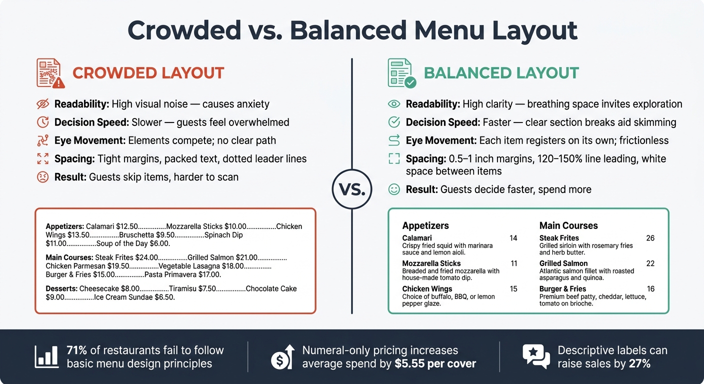
It also helps to keep fewer items in each section. A crowded section feels heavy fast, while a balanced one gives the eye room to move. Put those two layouts next to each other, and the difference is hard to miss.
Crowded vs. Balanced Menu Layout: A Side-by-Side Look
Crowded vs. Balanced Menu Layout: Readability & Design Rules
A side-by-side comparison makes the difference immediate. You can see it fastest when both layouts sit next to each other.
A crowded menu fills almost every inch with text and symbols. A balanced menu uses space to lead the eye.
| Layout Type | Readability Impact | Guest Decision Speed | Spacing Effect on the Eye |
|---|---|---|---|
| Crowded | High visual noise; can cause anxiety [6] | Slower; guests may feel overwhelmed by too many options [6] | Elements compete for attention; the eye has no clear path |
| Balanced | High clarity; breathing space invites exploration [1] | Faster; clear section breaks allow quick skimming of signature items [1] | Each item registers on its own; the eye moves without friction |
That visual gap is why spacing matters so much in menu development and culinary training. In training, this kind of comparison gives teams a simple way to see how layout affects guest behavior.
As Petros Mavros puts it:
"A menu should create rhythm, not chaos. It should give the kitchen control, the service team confidence, the guest pleasure, and the business a reason to continue investing in quality." [4]
Balanced spacing keeps the page readable and helps the ordering process move along. It turns layout into a clear, teachable menu-development choice.
How These Rules Apply in Culinary Training and Menu Development
Culinary training treats menu spacing as an operational skill. It helps chefs build menus that are faster to read and easier to run.
Students learn early on that menu layout shapes both guest choice and the pace of service. In class, that idea stops being theory and starts becoming part of the work.
Park City Culinary Institute applies these ideas in hands-on culinary training in Salt Lake City and Park City, with online options that teach menu engineering and portion control.
From there, students use spacing to make placement decisions. They also learn to put signature or high-profit items where the eye tends to land first, like the top-right corner or the center of the page. That helps guide attention to the dishes that matter most.
These layout choices become part of day-to-day menu planning. In plain terms, spacing isn’t just a design detail. It’s a menu-development skill students can use before they ever run a menu of their own.
Conclusion
Readable menus give each item space to breathe. Margins, line spacing, grouping, white space, section breaks, price placement, and text density all help people scan the page with less effort. Those layout choices shape how guests read, compare options, and make up their minds.
Put it all together, and good spacing makes menus easier to scan and decisions faster.
The payoff isn’t just visual. Descriptive labels can raise sales by 27% [6], and numeral-only pricing can increase spending by $5.55 per cover [3]. That’s the real value of spacing: it cuts friction at the table.
The goal is simple: less clutter, faster decisions, better guest experience. A well-structured menu looks clean and helps guests choose faster.
FAQs
How do I balance white space with limited menu space?
Don’t cram the layout. A packed menu can feel messy and hard to scan. Instead, use generous spacing so guests can move through your offerings with ease.
You also don’t need to fill every bit of the page. Use visual anchors like icons, shading, or subtle boxes to draw attention to certain items or daily specials while keeping the design clean and easy to read.
What font sizes work best with these spacing rules?
Choose font sizes that put easy reading first, so guests can scan the menu without effort. The right point size depends on your menu’s shape and layout, but it needs to strike a balance between style and clarity.
Stick with fonts that are simple to read, like Helvetica or Baskerville, and skip ornate styles that make text harder to follow. The font size should also leave room for white space and clear grouping, instead of making the page feel cramped.
Should menu spacing change for single-page vs. multi-page menus?
Yes. Menu spacing should change based on the menu format, whether it’s a single-page menu or a multi-page one.
The goal stays the same: use enough white space to keep the layout orderly, avoid a cluttered look, and help guests scan items with less effort.