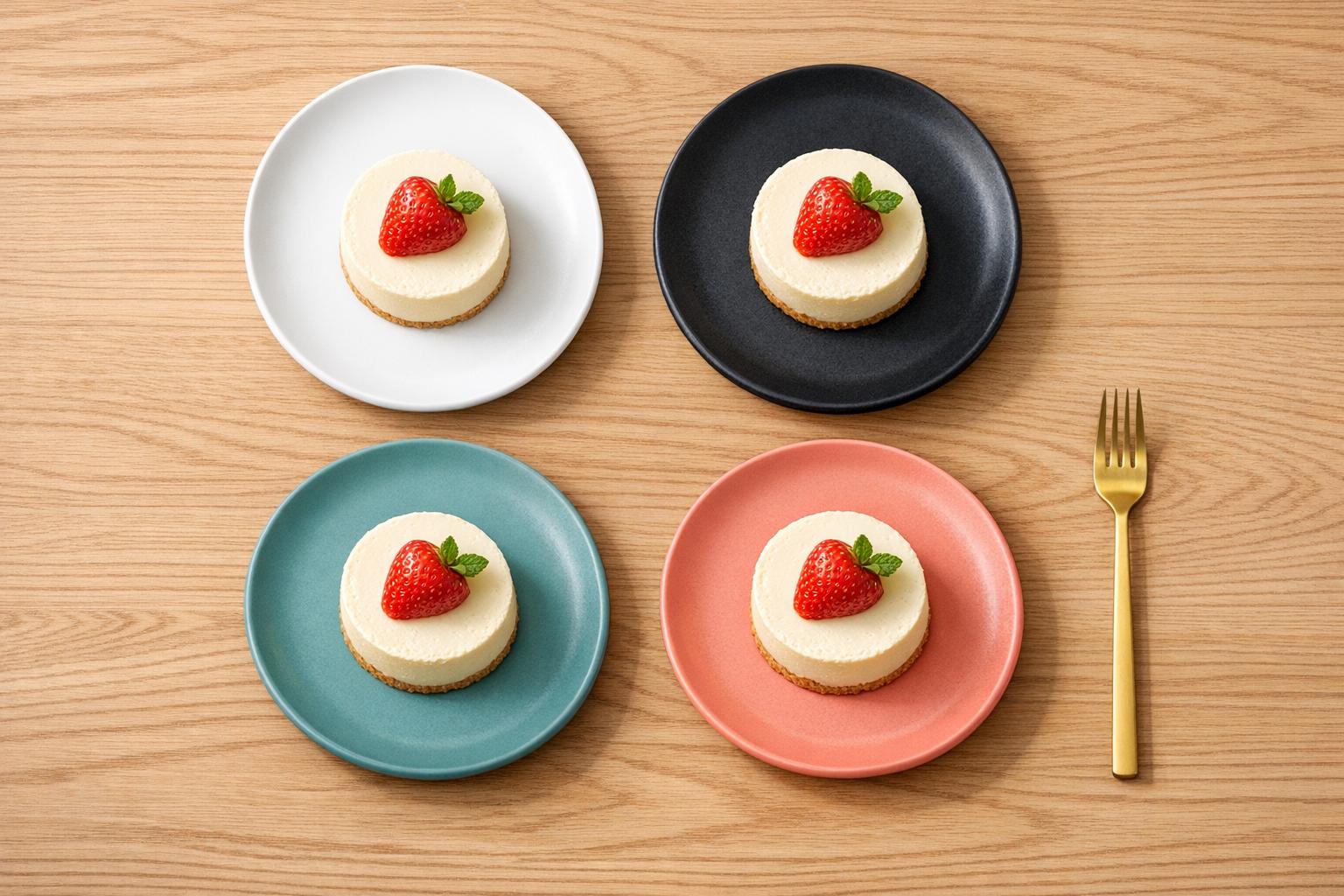
The color of your plate affects more than just how food looks – it influences taste, portion perception, and even appetite. Here’s what you need to know:
- White plates make food colors pop, enhancing sweetness and presentation.
- Red plates stimulate appetite and amplify sweetness, ideal for desserts or hearty meals.
- Blue plates calm diners and may reduce hunger, promoting mindful eating.
- Green plates evoke health and freshness, perfect for salads or plant-based dishes.
Key Insight: High color contrast between food and plate enhances visual appeal and flavor perception, while low contrast can lead to overeating. Use these insights to create a dining experience tailored to your goals, whether it’s portion control, indulgence, or health-focused meals.
An Oxford University professor explains why the colour of a plate can make you eat less food.
sbb-itb-7261261
How Different Plate Colors Affect Diners
Plate colors send subtle signals that shape your experience before you even take a bite. These visual cues influence how you perceive flavors, portion sizes, and even your level of hunger. By understanding the impact of different colors, you can create a dining experience that’s both visually appealing and psychologically engaging. Let’s break down how specific plate colors – white, red, blue, and green – affect the way we eat.
White Plates: Highlighting Food’s Natural Beauty
White plates act like a blank canvas, letting the colors and textures of your food take center stage. The stark contrast they provide makes every detail of the dish pop, giving the presentation a sharper, more refined look [1][4]. For example, a study found that strawberry mousse served on white plates was perceived as sweeter and higher in quality compared to when it was served on black plates [5].
White plateware works particularly well for intricate dishes where subtle textures matter or for desserts that benefit from a clean, simple presentation. This natural contrast can enhance the visual appeal and even elevate the perceived sweetness of your food [5]. Now, let’s see how red plates bring a completely different energy to the table.
Red Plates: Stimulating Appetite and Sweetness
Red plates grab attention and influence how flavors are perceived. Research involving over 5,000 participants revealed that red drinks were consistently rated as sweeter than drinks of other colors [7]. The brain links red hues with ripe, sweet foods like berries, which can increase heart rate and stimulate appetite. Interestingly, serving desserts on red plates can allow for a reduction in sugar content – up to 10% – without sacrificing perceived sweetness [5][7].
"Red ceramic plates are some of the most powerful storytellers on the table." – Amelia Grant, Tabletop Stylist [6]
Red plates are a great choice for desserts or hearty meals, as they amplify sweetness and richness. However, they can be polarizing – some picky eaters might find food served on red plates saltier or less appealing [7]. If red excites the senses, blue offers the opposite effect by calming them.
Blue Plates: Calming and Slowing Down Eating
Blue plates encourage a more relaxed dining pace and can even help curb appetite. Since blue is rarely found in natural foods (aside from exceptions like blueberries), the brain doesn’t associate it with eating, which can lead to reduced hunger [1][4]. This makes blue dinnerware a smart option for those looking to eat more mindfully or avoid late-night snacking [4].
"Blue is relatively rare in natural foods and, at high saturation, is often read as artificial or even suggestive of spoilage." – Amelia Grant, Tabletop Stylist [7]
While soft blues can be soothing, overly vibrant blues might backfire, making food seem less appealing or even artificial. Picky eaters, in particular, may find snacks served in blue bowls less desirable and might even perceive them as saltier [7]. Blue plates are ideal for creating a calm, measured dining experience. Meanwhile, green plates bring a sense of nature and freshness to the table.
Green Plates: Emphasizing Freshness and Health
Green plates evoke thoughts of nature, freshness, and health. This color is closely tied to vegetables, herbs, and other plant-based ingredients, making it an excellent choice for salads and meals focused on wellness. Unlike red, which signals indulgence, green suggests acidity and a connection to unprocessed, natural foods.
Using green plateware reinforces the wholesome qualities of fresh, plant-based dishes. It’s a subtle way to highlight the health-conscious aspects of your meal and create an overall sense of vitality and balance.
Using Color Contrast and Pairings
By tapping into the psychology of color, you can use contrast and complementary pairings to elevate a diner’s experience. The contrast between plate and food colors not only enhances the visual appeal but also influences how diners perceive and interact with their meals. High contrast makes the edges of food more defined, highlighting details and improving the overall presentation [4]. On the flip side, when plate and food colors are too similar, portions can appear misleading, often leading to over-serving [10]. This lack of distinction can make even the most carefully crafted dish seem visually dull.
High Contrast for Better Visibility
Contrast is a game-changer in food presentation. It draws attention to the food and makes it visually pop. For instance, white plates are a classic choice because they make reds, deep greens, and darker proteins stand out, which is why they’re so popular in professional kitchens [8]. However, lighter foods like pasta, potatoes, or chicken can blend into white plates, losing their visual appeal. For these dishes, darker plates – like black or deep brown – create a striking contrast that keeps the presentation engaging [8][9].
"High contrast sharpens visual borders; therefore, food servings and details are more obvious, thereby elevating your expectations of flavor." – Malacasa [4]
This isn’t just about looks. Oxford University research shows that higher color contrast between food and its plate can actually enhance taste perception [4]. The sharp contrast signals to the brain that the food is fresh, thoughtfully prepared, and worth savoring.
Complementary Color Pairings
Contrast is just one piece of the puzzle – pairing complementary colors can take a dish to the next level. Colors opposite each other on the color wheel, like red and green or blue and orange, create a vibrant, balanced presentation. For example, serving red foods like tomato-based pasta or strawberries on green plates amplifies their freshness and vibrancy [10].
When it comes to green foods such as salads or herbs, warmer plate tones like pink or yellow can offer a gentle contrast that enhances the dish’s freshness without overpowering it [8][10]. Meanwhile, blue or gray plates work beautifully with warm-colored foods like yellows, oranges, and reds, providing a cool contrast that makes those colors pop [8]. Even subtle shade choices matter – warmer white plates are ideal for orange-red foods like tomatoes, while cooler whites complement blue-red foods like beets, ensuring visual balance [10].
How to Choose the Right Plate Color
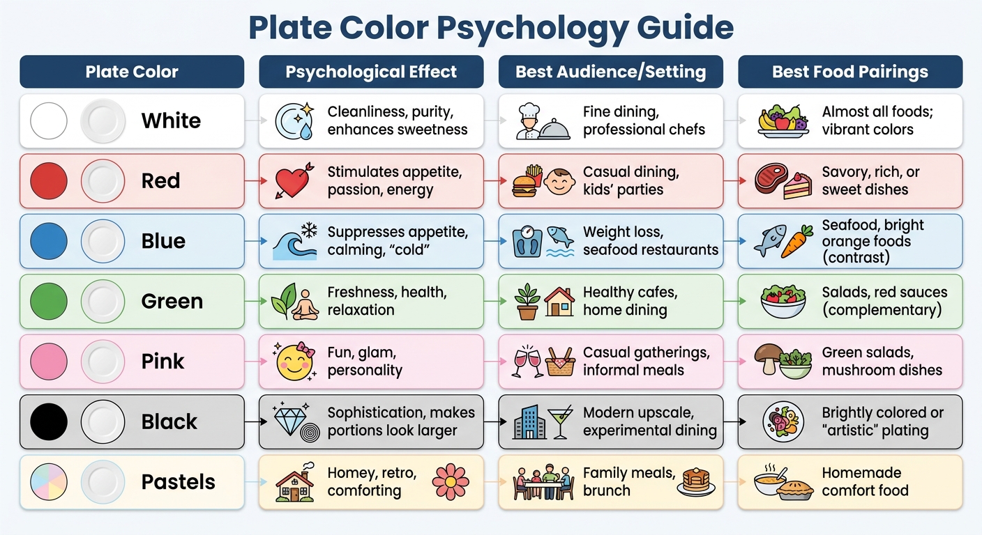
Plate Color Psychology Guide: Effects on Appetite and Food Perception
Selecting the right plate color can do more than just complement your dish – it can shape how people perceive taste, portion size, and even their overall dining experience. The color you choose should align with your dining goals and the preferences of your target audience. For instance, if portion control or weight management is a priority, blue plates are an excellent option. Blue is rarely found in natural foods, and it can subconsciously suppress appetite by evoking associations with spoiled items [10]. On the other hand, if you’re trying to encourage kids to eat more vegetables, green or orange plates can make those veggies look more appealing [1].
Your choice should also reflect the type of cuisine, portion control goals, and specific needs of your diners:
- Cuisine Type: Fine dining often leans toward white or slate gray plates for an elegant and refined look. Casual dining spaces, however, might opt for vibrant colors like red, orange, or yellow to create a lively atmosphere. For seafood, aqua or light blue plates can evoke a sense of freshness [4].
- Portion Control: The contrast between the plate and the food matters. Studies show that low contrast can lead diners to serve themselves 22% more food [2]. High-contrast colors – or even black plates – can help moderate portions [10].
- Special Populations: For elderly diners or those with cognitive impairments, vivid colors can make meals more enticing. High-contrast plates are particularly effective in these cases [1].
To simplify your decision-making process, here’s a quick reference table that outlines the psychological effects, ideal settings, and best food pairings for various plate colors:
Plate Color Comparison Table
| Plate Color | Psychological Effect | Best Audience/Setting | Best Food Pairings |
|---|---|---|---|
| White | Cleanliness, purity, enhances sweetness | Fine dining, professional chefs | Almost all foods; vibrant colors |
| Red | Stimulates appetite, passion, energy | Casual dining, kids’ parties | Savory, rich, or sweet dishes |
| Blue | Suppresses appetite, calming, "cold" | Weight loss, seafood restaurants | Seafood, bright orange foods (contrast) |
| Green | Freshness, health, relaxation | Healthy cafes, home dining | Salads, red sauces (complementary) |
| Pink | Fun, glam, personality | Casual gatherings, informal meals | Green salads, mushroom dishes |
| Black | Sophistication, makes portions look larger | Modern upscale, experimental dining | Brightly colored or "artistic" plating |
| Pastels | Homey, retro, comforting | Family meals, brunch | Homemade comfort food |
Professional Plating Techniques
Professional kitchens take the psychological effects of plating to the next level, turning these insights into precise techniques that enhance both visual appeal and flavor perception. For chefs, plate color becomes an "invisible ingredient" that subtly shapes how diners experience their meal. Neutral tones like white, ivory, and slate gray are often the go-to choice in upscale kitchens. These shades act as a blank canvas, letting the vibrant colors and textures of the food shine [4]. This principle lays the groundwork for the deliberate use of contrast and color in advanced plating.
One standout technique is the use of color contrast. High contrast not only makes food edges appear sharper but also raises flavor expectations. Research from Oxford University even found that food served on white plates is perceived as sweeter and more savory compared to food on darker plates [4].
Chefs also align plate colors with the mood or theme of the dining experience. For example:
- Fast-casual restaurants often use warm tones like red, orange, and yellow to stimulate appetite and create an energetic atmosphere [4][10].
- Seafood restaurants lean toward aqua or light blue plates to evoke freshness [4].
- Dessert presentations often feature black or dark-toned plates to amplify a sense of indulgence [4].
- Health-conscious eateries favor green and earthy tones to suggest wellness and a connection to nature [4][10].
Beyond aesthetics, plate color acts as an "invisible seasoning", subtly influencing how flavors are perceived [3]. Red or pink plates can enhance the perception of sweetness, while green or yellow plates suggest freshness and acidity. Chefs even match plate undertones to complement the natural hues of a dish. For instance, warmer whites pair beautifully with tomato-based creations, while cooler whites enhance the vibrancy of beet-infused dishes [10].
For those looking to refine their plating skills, Park City Culinary Institute offers hands-on courses led by award-winning chefs. These programs combine artistic plating techniques with color psychology, helping culinary enthusiasts transform how diners experience food.
Conclusion
The color of your plate can influence how you perceive portion sizes, freshness, and even flavor. Warm tones like red and orange tend to boost appetite, while cooler shades like blue have a calming effect that can help curb overeating. White plates enhance sweetness, and green often signals health and freshness. Whether you’re aiming to stimulate appetites with bold colors or create a more mindful eating experience with calming hues, each choice has its own psychological impact that can elevate the dining experience.
You don’t need a professional setup to start experimenting with these ideas. Begin with simple, neutral plates – like white or ivory – and incorporate colorful accents for specific occasions. For instance, plating vegetables on green or orange dishes might make them more appealing to kids, while blue dinnerware can encourage slower, more thoughtful eating habits [4]. These small adjustments can make a big difference in how meals are enjoyed.
"Set your table as if it were part of the recipe, and let sight and touch season your dishes as generously as salt and sugar ever could." – Tabletop Stylist, Malacasa [5]
If you’re ready to dive deeper, hands-on training can help refine your skills. Programs like those at Park City Culinary Institute offer courses that blend artistic plating techniques with the science of color psychology. Led by award-winning chefs, these classes show how thoughtful presentation can transform the dining experience.
FAQs
Do plate colors really change taste?
Yes, the color of a plate can influence how food tastes by shaping visual and multisensory perception. The choice of color can make the presentation more appealing, change how intense flavors seem, and even affect appetite. When used carefully, this psychological effect can make the dining experience more enjoyable.
What plate color helps with portion control?
Darker-colored plates can play a role in portion control. The contrast between the plate and the food can make servings look larger than they actually are. This visual trick might naturally encourage you to serve smaller portions, making it easier to manage how much you eat.
How do I match plate and food colors?
Using color psychology can transform how food is presented. The trick lies in balancing contrast and harmony. Contrasting colors make dishes pop, drawing attention to their vibrant details. On the flip side, using similar tones can cause the food to blend into the plate, losing its visual impact.
For example, picture a bright green salad served on a neutral-colored plate – it stands out beautifully. Or consider warm-toned dishes, like those with rich reds or oranges. Pairing them with cooler-toned plates creates a balanced and eye-catching presentation.
The goal is simple: use contrast to make the food the star of the plate.